Moya Fagan - Final ABCs
Final Letters
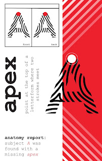
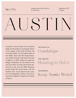
My final idea was to make an adult coloring book using patterns made with the letter in the corresponding font. The colors on the left are still the colors that the person should use to color in the pattern to help them remember the qualities of each font and start to see patterns (ie. a serif font is more likely to be high contrast than a sans serif).
My final idea was to make an adult coloring book using patterns made with the letter in the corresponding font. The colors on the left are still the colors that the person should use to color in the pattern to help them remember the qualities of each font and start to see patterns (ie. a serif font is more likely to be high contrast than a sans serif).


Terrific project. The patterns using type are great. The information is really strong, the interactive component is very cool. The one element I think you should consider is that the visual size of the title font on each page varies quite a bit. You may want to either make that consistent (which is sometimes challenging and must be done by eye since point sizes do not always measure exactly from one typeface to the next) or vary them more widely with rhythm throughout the project.
ReplyDeleteWow, amazing job! I remember where you were a week ago in class and this is so different from that in a great way! Being totally honest, I'd probably buy a coloring book like this. I enjoyed how you used varying fonts for each page and the simplicity of the colors vs. the stark white/black of the rest of the page. Great job Moya!
ReplyDelete