What I learned today
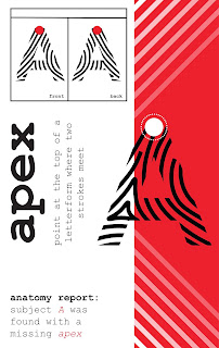
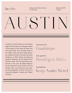
The easiest part of deciding which design to pick was when the designs differed through type. I was usually able to pick the right design based on type. When the type was off centered, too big, or not the right color, I was able to tell that something was off. I struggled mostly with the different tones of the designs. When the colors of the backgrounds or icons were slightly off, it was more difficult to tell any differences. The quicker I made a decision, the more accurate I was. This mainly happened throughout the easy level. Obviously as the levels became more difficult, the longer I had to stare at the designs and this would cause me to become indecisive and second guess myself.


Comments
Post a Comment