3D Type Final Putman
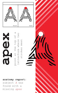
Here is my final product for my 3D type project. It was pretty fun conceptualizing and putting the thing together while also figuring out how to make my setup more professional looking. I came across a lot of photos using white paper as its background to bring out shadows more clearly.
I decided on using a white background to project the shadow onto for more clarity, as seen here
I also made a video of my type moving from one side of the canvas to the other as if the light cycle of the sun was sped up for a little visual pun of time passing along the paper. Unfortunately I couldn't upload this to the blog, but it will be on D2L.
This project was a huge deviation from all my work with type previously; and probably one of the most beneficial because of this. Type is usually limited to just two dimensions, and thus, people don't expect it when type leaps off the page or is arranged in a way where it is more than just marks on a flat surface. The original shadow type photo I saw in Greece caught my attention because it was different in this way. This caused the realization that 3D type is a vital part of any typographer's toolkit, not just an eye-catching one-off that just anybody can create successfully.


Comments
Post a Comment