Alina Rudnick - Final ABC's
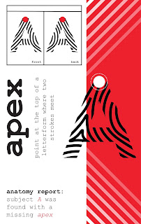
For my final I decided to run with the feedback I was given and simplified it to only showing the patterns on the relevant area with the term and got rid of the color block around the terms. I took the palettes for the flat blocks of color from different parts of the pattern to make it come together better. I also ended up adding the lowercase versions of the characters as some of the terms I used applied more to lowercase than uppercase. This made having the name of the term/pattern look awkward on the sides so I decided to put it under the letters which turned out to look far better.


Really appreciate how you’ve improved the project. It makes much more sense and is visually stronger. “E” is missing its pattern. I’m not sure if the italic is unclear perhaps the letter form itself (in black) should be italicized and the pattern used in a different fashion or shadowing it. In some cases the illustration of the concept needs to be more specific (in “neck” the pattern should not be on the stem). Watch for line breaks that will be more balanced and avoid widows. This looks great!
ReplyDelete