Kelli Heflin- Final ABC's
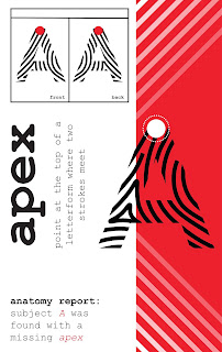
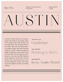
For my final ABC's I changed around the color scheme based on color palettes created from pictures of each location and colors I felt fit the location nicely. I also changed the size of my work to a smaller postcard size, when printed they will all be inserted into a black "gift card like" sleeve and will be a set of typographic postcards. Each postcard is printed with a solid color on the back.


This is so much stronger! Look carefully at the letterspacing. Some of the titles are differently kerned (letter-spaced). I would still drop Papyrus and Zapfino. and substitute better fonts. Their base form is poorly designed. The Z page is the old design. Also make sure that your bullet point colors are a stronger value against the background color.
ReplyDeleteI loved your original layout, but changing the colors to make it more diverse was a good call! The color choices are great as well. I think it will look good when seeing it printed on paper.
ReplyDelete