April Shiel: Textbook Two
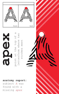
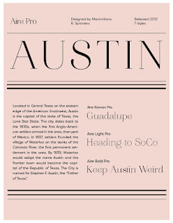
My concept was mostly black and white, more minimalist aesthetic, something similar to an Old Time Newspaper like they had during the Wild West Times. I personally have always found the sheer amount of colors and boxes and little sections distracting when I read textbooks, and I love the typography of old newspapers, so I attempted something in a similar vein.
My ipad design is really weak, so any ideas for that would be helpful. I really struggled with that.


Comments
Post a Comment