Camille Roubik - Textbook Spreads, Phone, Tablet
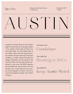
I had a lot of fun creating the second spread. It was a little challenging to find ways to break up the text, and place the images. Overall, I'm pretty content with where these are headed. I refined the timeline within the first spread, and rearranged some elements on the page to make it seem less busy. I am considering reworking the 2nd phone screen design with the sections listed; now that I am looking at it with all of the other pages, it seems a little less dynamic than the others.


My concept behind this project was to develop a modern and sophisticated design with heavy photographic imagery. This was done through the integration of hard-edged elements, sans serif headings, and a simple, yet sophisticated color palette. I refined the photographic elements in Photoshop by creating duotones and linear gradients, creating a more dynamic feel to the images themselves.
ReplyDelete