Kelli Heflin- Textbook Spreads
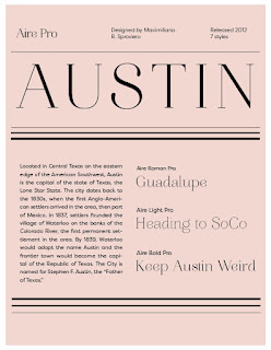
I am fairly happy with what I have done so far. I have two alternative covers for the spreads that I cannot decide between and would love anyones opinion based on which covers you think are easiest to read. I also want to play around with other typefaces for emphasis but didn't get the chance to yet. 

IPHONE SPREADS:


TABLET SPREADS:


I really love your color palette and direction you're headed! You wanted an opinion on the cover choices...I think you should definitely go with the second option you posted where there is no overlay on the image. The beauty of those rocks shouldn't be hidden behind an overlay! The complementary colors are really nice as well and it creates a nice contrast.
ReplyDeleteMy concept was inspired by a a typical magazine. When I was in high school I found magazines to be more visually interesting than a textbook, so I wanted to incorporate that into my design. I originally found the first photo of the west coast(on the first page of the book spread) and from there I was inspired to create the rest of my design.
ReplyDelete