Marlee- textbook moodboard
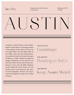
With this project, I want to use the color scheme to the left of the mood board that includes greys which i will be using with black and white photos. i visioned using black and white photos mostly, unless i could find photos that fit this color scheme. I want to make other details and important information pop with the colors seen in these photos. I chose helvetica bold for now for my titles and so on. For my body text, I wanted garamond. I actually picked garamond light as my body text before i made any other decisions. I like that font. As of now, i want the layout to be pretty simple while delivering a lot of information. I want to play with shapes and different cool layouts to do for the visuals. Since the pictures will be mostly black and white, i want to have them involved in some unique ways that wont be overkill. After looking at these uploaded pictures i think that I would like to search for other bolder fonts to possibly add more variety in hierarchy. I love playing with hierarchy so i think that another goal of mine with this project is to master that concept.
here is a link to an article i was reading about peter saville and burberry's new logo:
https://www.theguardian.com/fashion/2019/feb/14/graphic-artist-peter-saville-on-creating-burberrys-new-logo


The America Moves West is a fab beginning. Not sure about the "Helvetica" Chapter but it presents Garamond Pro for the body text which is strong. The color palette works well with the black and white illustration treatment. Not sure about the drop shadow on the text, it's out of synch with the rest; unless they are barely noticeable (very tight to the type itself) they can look dated. I understand the treatment provides emphasis but perhaps try other alternatives.
ReplyDelete