Monika Chislov ABC'S
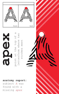
For this project I wanted to do clear designed glossary. I was imagining something that could easily be used to study with. I still haven't settled on certain design aspects, but at this point I need to submit. I would like to add a few more things to make the designs more interesting and engaging, but still clean and straight to the point.


I think that the example text for 'R' looks a little squished? And overall I'm not sure if there is a reason for the colors to each letter, but I think a pattern of the colors would be helpful to create more of a cohesive design? And the curved shape is interesting, but I think that it doesn't feel natural. That being said, I do like the colors that you used!
ReplyDeleteI think you might want to make the type size for the terms smaller, some of the definitions come close to or are touching the letters of the terms, like the y in Opacity. Or you could resize the design template, the curve takes up the space I think the definitions should have.
ReplyDelete