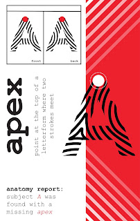
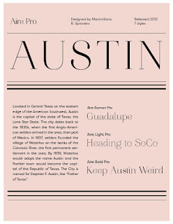
Moya Fagan Textbook
For my textbook, I wanted to use an old west color palette using mostly reds. I started off by taking some colors from this image:
I liked the colors, but they didn't form a cohesive palette. I took the colors that I liked the most from it and made a palette from their tints and shades. I ended up with mostly reds and a couple of yellow accents. The timeline is meant to mirror the way that the horses in the image look, but I had some trouble getting that to come across. I also feel like the spread looks really crowded in certain areas, but I wasn't sure how small I could go with the text to keep it legible.
Textbook Moodboard and Opener
Textbook Moodboard and Opener


Terrific process description! The type choices work well together. The Timeline could be less deep and take up less room. You may be planning to add icons but right now it takes more space than it needs. The type size appear s acceptable. You don't need that many rules for the line treatment. The Sections look terrific! Take another look at the type which is running to close to the right-hand trim of the page. Eliminate hyphens in the right hand page as much as possible; re-rage to provide more legibility. You might consider running the photo into the right hand page and placing the Essential question over the photo or above the Chapter title. Chapter 18 could be smaller and moved a bit lower. Not sure if the title should be flush left. You're at the stage where what seems to be small changes can make a great difference in pulling it together.
ReplyDeleteThe photo is quite beautiful!
Delete