Textbook Remix:
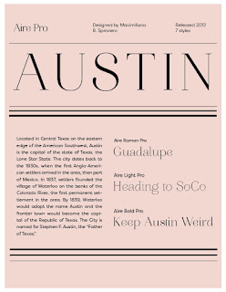
I really struggled to find an aesthetic and style I wanted to go with, and after many failed attempts, decided to try and go for a black and white look using a font called Dapifer. I'm a fan of simple and clean stuff, and Dapifer is my go to font usually, so it seemed to work mostly. There's some parts I'm not happy with that need to be worked out, but for a first attempt at these pages I'm pleased for the most part.
I need to mess with the font layout though. That's not great.
I need to mess with the font layout though. That's not great.


Beautiful, elegant and understandable. Consider making the Chapter title larger than the Chapter number. Also consider embellishing the timeline. Though the elegance is appreciated, you could consider some ways (icons, additional images, typographic elements) that would further strengthen it, and engage a high school audience.
ReplyDelete